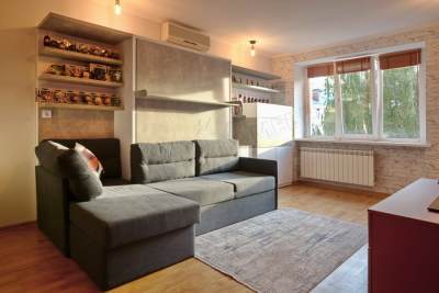
Ipsilantievsky lane, 5 | Murphy Bed & Sofa Combo "SOUL"
This is one of our favorite projects. And now we'll tell you why:
1. Since the nursery was created for a boy, the designer decided that it was possible to make a moderately masculine design, but with the addition of bright colors. This idea was realized by combining two types of chipboard: ceramic red chipboard and chipboard, which has a concrete-like texture. In order not to overload the appearance of the furniture, white glossy facades of Nymphea Alba were also added.
2. We used a large corner sofa with a built-in niche. For this type of bed, we have integrated a sofa with Dolphin mechanism into the project. On one side, the sofa was limited by a thin armrest, and on the other side, we made a small protrusion, which allowed the soft large pillows to not fall.
3. For the first time in this project, we used designer shelves, which are unusually connected to each other, creating a certain geometric pattern.
4. As children are prime collectors, we have installed many open shelves. Customers immediately approved of the idea, as they already had collections of toys and small glass Coca-Cola bottles from different countries. At our discretion, they look as stylish as possible and fit perfectly into the overall concept of the room.
5. Entering the room, you can immediately see that one of the main objects in the children's room is missing - a desk. This was one of the wishes of the clients. Instead of a standard desktop, we have created an installed workplace.


